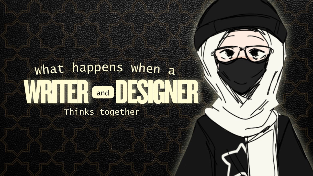
Writers and designers are often seen as working in completely different worlds. One plays with words, the other with visuals but what happens when the writer steps into the shoes of a designer and starts thinking the way designers do? The results are often sharper, more user-friendly, and more impactful than either craft could achieve alone.
I’ve noticed again and again that when words are shaped with a designer’s mindset clarity, flow, balance, and user-first thinking they stop being “just content” and start becoming part of the design itself and honestly, that’s where the magic happens.
Writing Without Design Thinking Feels Like Throwing Words on a Page
Let’s face it: a lot of writing, especially online, ends up as walls of text. Maybe it’s packed with information, maybe it’s clever, but it doesn’t connect, it doesn’t guide the reader, it overwhelms them.
Think about long articles or reports you’ve come across online. Sometimes the content is valuable, but it’s buried under walls of text, and no clear structure. You find yourself rereading the same lines, trying to figure out what the writer actually means that’s writing without design thinking the words are there, but they’re not shaped in a way that respects how people read and process information.
Now imagine the opposite: an article broken into digestible sections, with clear subheadings, space to breathe, and language that flows like a conversation instead of a lecture you don’t just read it; you move through it with ease, that’s writing informed by design principles. It’s not just about what’s being said, but also how the experience of reading feels.
Thinking Like a Designer Means Putting the Reader First
Designers talk a lot about empathy stepping into the user’s shoes, seeing what they see, and experiencing what they’ll experience, writers can learn from that.
When a writer adopts this mindset, their job shifts from “I need to say everything” to “What does my reader actually need here?” That’s why product copy from companies like Slack or Notion feels so effortless, it doesn’t just tell you what to do, it guides you with the same care a designer puts into a flow.
Instead of paragraphs of explanation, you’ll see a small line like: “Try typing / to see what you can do.” Simple. Clear and usable. It feels almost invisible, yet it’s what makes the whole experience smooth.
Words Become Part of the Design, Not Just Decoration
The big mistake many make is treating writing as an afterthought, the design gets created, then words are “slotted in” But when a writer thinks like a designer, the text and the design support each other.
Take Airbnb, for example, their interface isn’t just clean because of layout and colour, it’s clean because the words are minimal and functional. “Where to?” is a much more usable search box prompt than “Enter your travel destination” That small design choice, powered by words, makes the interaction feel lighter.
The same happens with error messages. Compare “Error 404: Page not found” with “Oops, we can’t find that page, Let’s get you back on track” one is cold; the other is helpful, but neither is purely about design nor writing alone it’s the overlap.
The Danger of Pretty Words Without Design Thinking
Just like pretty UI without UX doesn’t work, pretty writing without design thinking falls flat a tagline might sound poetic, but if it confuses the user or delays their decision, it’s not doing its job.
Think of checkout buttons on e-commerce sites. If the button says “Continue” instead of “Place Order,” it may sound smoother, but it creates hesitation, people pause and wonder: Am I done? Is this the final step? That moment of doubt is exactly what design-thinking-in-writing helps avoid.
Good writing doesn’t just look nice on the page, it functions, it moves people forward without friction.
Why Collaboration Matters Even More
When writers think like designers, they also collaborate better, instead of handing off long text blocks, they start asking:
How will this text fit into the flow?
What will the user feel here?
Can fewer words say more?
This kind of thinking bridges the gap. It makes the handoff between design and content seamless and when design and content stop fighting each other, users win.
Look at apps like Duolingo, the words are playful, the design is playful and together, they create an experience that feels cohesive. Imagin If either side tried to do it alone, it wouldn’t have worked as well, would it?
Learning to Think Like a Designer Is an Ongoing Practice
None of this is about mastering it once and being done, even the best writers and designers constantly test, fail, adjust, and relearn and It’s the same with this mindset.
Every time you write an onboarding message, a microcopy line, or a help article, ask:
Does this feel like it was designed for someone, or just written down?
If I read this as a complete beginner, would I know what to do next?
Does it move the user forward, or make them pause?
The more these questions guide the writing process, the closer you get to that sweet spot where words and design are no longer separate.
The Sweet Spot: Writing That Feels Designed
When writers think like designers, copy becomes smoother, interfaces feel friendlier, and users walk away with fewer questions. It doesn’t matter whether it’s a headline, a button label, or a help page each and every time outcome is the same: less confusion, more connection.
And maybe that’s the biggest lesson here. Great design isn’t just about shapes, colours, or layouts it also lives in the words we choose the tone we set, and the clarity we deliver.


